

Rixzo - Nuxt3 Premium Bootstrap Admin & Dashboard Template
Rixzo – Nuxt3 Bootstrap Admin & Dashboard Template, With these template formats, it's very easy to create a presence and grab someone's attention around the web page Because the template is built using Nuxt3 components HTML5, CSS3, Bootstrap framework and with Sass. So please before you start working with the template take a quick look on the documentation so that you can easily built your website.
If You Love Our Template Design Please don't forgot to rate it. Thank you so much! 😊
Dashboard
Welcome to Rixzo – Nuxt Bootstrap Premium Admin & Dashboard Template- Created Date : 25/Jun/2025
- Author : Spruko
- Company : Spruko Technologies Private Limited
Thank you for showing interest towards our admin template. Feel free to contact us any time. We have a dedicated team to provide you the best support. If you want any queries open support ticket https://support.spruko.com.
Rixzo is a Premium Nuxt3 Bootstrap Admin Template using modern and minimal design. It is fully flexible user-friendly and responsive. Rixzo Modern template is powered with Vue Pages, SASS, & Bootstrap which looks great on Desktops, Tablets, and Mobile Devices. This Template Includes 180+ Vue Pages . No Need to do hard work for this template customization. We already designed it and you can easily design your website just how you like it. This template using React-Bootstrap framework. After Purchased this template you will get All JS files,CSS and SCSS Files.
It has super clean flat user interface admin design, easy customizable components and widgets.The Template comes with a awesome unique design also we ensure you can easily design template.
It is a fully responsive layout for all type of devices. Works on all major web browsers, Desktop, iPhone, iPad, Tablet and all other smart phone devices
Once you Purchase Rixzo Nuxt3 Bootstrap Admin Template, you will be able to get free download of all future updates.
- Firefox
- Safari
- Opera
- Chrome
- Edge
Theme Styles
- Light & Dark Themes
- LTR & RTL
- Vertical & Horizontal Navigation Styles
- Menu Click & Hover Styles
- Icon Click & Hover Styles
- Page Regular & Classic Styles
- Full Width & Boxed
- Menu Fixed & Scrollable
- Header Fixed & Scrollable
- Sidemenu Closed
- Icon Text Menu
- Icon Overlay
- Detached
- Double Menu
Theme Colors
- Menu Light
- Menu Dark
- Menu Color
- Menu Gradient
- Menu Transparent
- Header Light
- Header Dark
- Header Color
- Header Gradient
- Header Transparent
- Theme Primary
- Theme Background
- Menu With Background Images
| No Jquery | Dark Layout | RTL Ready |
| Icons | Authentication Pages | Error Pages |
| 180+ Vue Pages | Easy to Customize | Bootstrap Responsive Framework |
| Form Elements | Maps | Ratings |
| Form Advanced | Form wizards | Profile Settings |
| Grid JS Tables | Data Tables | Gallery |
| Apex Charts | Chartjs Charts | Echarts |
| Full Calendar | Sweet Alerts | Swiper JS |
| Blog Pages | Mail App | Chat |
| File Manager | Invoice | Landing Pages |
| Pricing | Profile | Placeholders |
| Project Pages | Ecommerce Pages | Job Pages |
| NFT Pages | CRM Pages | Crypto Pages |
| Ribbons | Sortable Js | Tour |
| 24 * 7 Professional Company Support | Media Player | Under Construction Page |
| Color Theme Support (Primary and Background) | Neat, clean and simple design | W3C Validated |
NuxtJS Setup
Create a workspace and initial application
-
Run the following command to install the Nuxt.js CLI globally
npm install -g create-nuxt-app
- GO to directory where you want to create the Nuxt Project.
-
Open your terminal or command prompt. With the same directory you are
intended.
npx create-nuxt-app Your-project-name
- Follow the prompts to configure your project. You can choose the features you want to include, such as Routing, SSR, ESLint, and others.
-
Once After the project is create come to the project directory in
command prompt.
cd You-project-name
-
Run the following command to start your Nuxt.js application:
npm run devThis command will start the development server, and you can access your Nuxt.js application in your browser at http://localhost:3000.
Rixzo Setup
Prerequisites
Node.js
Download latest version of node.js from
nodejs.org.
Install Node.js using downloaded file.
To check your node version, run node -v in a terminal/console window (cmd)
Setup an Rixzo Template by
- Download the Rixzo.rar/zip file.
- Extract it and then go in to Folder here you will see a rixzo Folders
- For Example, Here I'm Choosing Nuxtjs-file
- Now from a terminal window, navigate to the directory containing your
application
Rixzo/Nuxtjs-file> - You can import all dependency by installing npm command
- Now you are in stage to successfully run Rixzo using below command:
npm run dev(or)yarn dev -
Once you serve your application by default it will take their default port
using
http://localhost:3000/
npm install(or)yarn install
Note
basically npm install is used to install all dependencies or devDependencies from a package. if there will be any dependencies which need to be installed but getting error message while installing, then use --force will help to install those dependencies.
The --force argument will force npm to fetch remote resources even if a local copy exists on disk. It will be on a last-dependency-downloaded-wins basis and will overwrite any previously downloaded dependencies.
npm install --forceNote
npm installIf your are using npm install, You have to delete the yarn.lock
yarn-lock file(or)
yarn installIf your are using yarn install, You have to delete the package-lock.json
(or)
yarn install --network-timeout 1000000If yarn will getting timeout issue use this command
package-lock.json filewe have to use only one file example: (for yarn yarn-lock) & (for npm package-lock.json) file
basically npm i is used to install all dependencies or devDependencies from a package. if there will be any dependencies which need to be installed but getting error message while installing, then --force will help to install those dependencies.
The --force argument will force npm to fetch remote resources even if a local copy exists on disk. It will be on a last-dependency-downloaded-wins basis and will overwrite any previously downloaded dependencies.
npm install --forceit will always skip peer dependencies (whatever those are) during installation even if there are no issues.
npm install--legacy-peer-depswe have to use only one file example: (for yarn yarn-lock) & (for npm package-lock.json) file
Static Hosting Nuxt3 Application
To Upload your static application for host on server using below command:
-
Before upload, you should need to make some changes in the
nuxt.config.ts file like below if you are uploading into sub-directory,
If you are uploading them in public then you can remove or you can add
'/'.
app: { baseURL: '/Rixzo/preview', // Replace with your desired base path }, publicPath: '/Rixzo/preview/', vite: { define: { 'import.meta.env.BASE_URL': JSON.stringify('/Rixzo/preview/'), }, }, env: { BASE_URL: '/Rixzo/preview', }, -
Before uploading, you need to generate the static site using the Nuxt.js
build process. Run the following command in your Nuxt.js project
directory:
npm run generate -
This command will create a dist or .output/public directory containing the static files of your Nuxt.js application.
-
Upload those files in your server to access them globally.
Generate the Static Site
Installation Video
						├── assets/
						├── |-- css/
						|   |-- |-- bootstrap.css
						|   |-- |-- bootstrap.min.css
						|   |-- |-- icons.css
						|   |-- |-- icons.css.amp
						|   |-- |-- icons.min.css
						|   |-- |-- icons.min.css.map
						|   |-- |-- styles.css
						|   |-- |-- styles.css.map
						├── |-- libs/
						├── |-- scss/
						|   |-- |-- bootstrap/
						|   |-- |-- custom/
						|   |-- |-- global/
						|   |-- |-- menu-styles/
						|   |-- |-- Pages/
						|   |-- |-- util/
						|   |-- |-- _switcher.scss
						|   |-- |-- _variables.scss
						|   |-- |-- bootstrap.scss
						|   |-- |-- icons.scss
						|   |-- |-- styles.scss
						├── |-- video/
						├── components/
						|   |-- |-- @spk/
						|   |-- |-- common/
						|   |-- |-- UI/
						├── data/
						├── layouts/
						|   |-- custom.vue
						|   |-- default.vue
						|   |-- landing.vue
						├── middleware/
						├── pages/
						|   |-- advanced-ui/
						|   |-- apps/
						|   |-- authenticatioon/
						|   |-- charts/
						|   |-- dashboard/
						|   |-- error/
						|   |-- forms/
						|   |-- maps/
						|   |-- pages/
						|   |-- tables/
						|   |-- task/
						|   |-- ui-elements/
						|   |-- utilities/
						|   |-- icons.vue
						|   |-- index.vue
						|   |-- widgets.vue
						|   |-- ...
						├── plugins/
						|   |-- chartjs.client.ts
						|   |-- plugins.ts
						|   |-- ...
						├── public/
						├── |-- icon-fonts/
						|   |-- |-- bootstrap-icons/
						|   |-- |-- boxicons/
						|   |-- |-- feather/
						|   |-- |-- line-awesome/
						|   |-- |-- Remixicons/
						|   |-- |-- tabler-icons/
						|   |-- images/
						|   |-- ...
						├── server/
						├── stores/
						|   |-- switcher.js
						├── utils/
						.eslintrc.js
						.gitignore
						app.vue
						nuxt.config.ts
						package-lock.json
						package.json
						tsconfig.json
-
Rixzo – Nuxt3 Premium Bootstrap-5 Admin Template /: Root template folder contain all html, js, css, scss, images and other files. -
-
assets/: Folder contain all the Rixzo Template assets which has css, js, scss, and images. -
-
css/: Folder contain assets which has complete styles. -
icons.css: It has all template icon links are importated.styles.css: Main style sheet for template
-
scss/: Folder contain all pages scss files and all plugins scss files also included. -
Video/: Folder contains video used in this template.
-
components: The components/ directory is where you put all your Vue components. Nuxt automatically imports any components in this directory (along with components that are registered by any modules you may be using).data: Reusable data in the application.layouts: Nuxt provides a layouts framework to extract common UI patterns into reusable layouts.pages: Nuxt provides file-based routing to create routes within your web application.plugins: Nuxt has a plugins system to use Vue plugins and more at the creation of your Vue application.public: The public/ directory is used to serve your website's static assets.-
icon-fonts/: Folder contain all types of icons which is used in this template. -
images/: Template images. store: The store directory is used for state amangement(pinia).
-
app.vue: The app.vue file is the main component of your Nuxt application.nuxt.config.ts: Nuxt can be easily configured with a single nuxt.config file.package.json: The package.json file contains all the dependencies and scripts for your application.tsconfig.json: Nuxt generates a .nuxt/tsconfig.json file with sensible defaults and your aliases..
Creating a Pages
You can generate new pages in Nuxt.js using the nuxt generate command
# Generates `pages/about.vue`
npx nuxi add page about

# Generates `pages/category/[id].vue`
npx nuxi add page "category/[id]"
Creating a Component
To create components using the Nuxt.js CLI (Command Line Interface), you can use the generate command. Here's how you can create components:
Creating a component using the Nuxt CLI
To create a component using the CLI:
npx nuxi add component YourComponentName- YourComponentName.vue
<YourComponentName> is the name of your component.
Creating a Custom Commands
In Nuxt.js 3, you can generate custom commands using the @nuxt/cli package. For example, to generate a custom command:
npx nuxt create command my-custom-commandPurpose of a starter kit
Introduction to the Nuxt Starter Kit Template:
The Nuxt3 template starterkit is a resource that helps developers kickstart their Nuxt web development projects by providing a preconfigured and ready-to-use template. It aims to simplify the initial setup and provide a foundation for building Nuxt3-based websites or applications.
Purpose of the Nuxt Starter Kit Template:
The purpose of the Nuxt Starter Kit Template is to save developers time and effort by offering a set of prebuilt files and configurations commonly used in Nuxt projects. Instead of starting from scratch, developers can leverage the starter kit to quickly set up a project structure that adheres to best practices and industry standards.
Benefits of Using the Nuxt Starter Kit Template:
The starter kit eliminates the need to set up the basic project
structure manually. It provides a well-organized file and folder
structure, including commonly used directories for separating code,
templates, assets, and configuration files. This allows developers to
focus more on implementing business logic rather than spending time on
initial setup.
Before using the Nuxt Starter Kit Template, developers should have a
basic understanding of Nuxt and web development concepts.
Starterkit Overview
You can use the Starterkit if you are creating a new project. It will be time-consuming to use the full admin version for a new project as Rixzo-Nuxt3 have more than 150 components.
We have provided all the pre-build layouts like Sidemenu, Header, footer and blank pages etc in the Starterkit.
For further information or support regarding the template, please contact us using the provided link.
https://support.spruko.com/Starterkit Folder Structure
                           ├── assets/
						├── |-- css/
						|   |-- |-- bootstrap.css
						|   |-- |-- bootstrap.min.css
						|   |-- |-- icons.css
						|   |-- |-- icons.css.amp
						|   |-- |-- icons.min.css
						|   |-- |-- icons.min.css.map
						|   |-- |-- styles.css
						|   |-- |-- styles.css.map
						├── |-- libs/
						├── |-- scss/
						|   |-- |-- bootstrap/
						|   |-- |-- custom/
						|   |-- |-- global/
						|   |-- |-- menu-styles/
						|   |-- |-- Pages/
						|   |-- |-- util/
						|   |-- |-- _switcher.scss
						|   |-- |-- _variables.scss
						|   |-- |-- bootstrap.scss
						|   |-- |-- icons.scss
						|   |-- |-- styles.scss
						├── |-- video/
						├── components/
						|   |-- |-- @spk/
						|   |-- |-- common/
						|   |-- |-- UI/
						├── data/
						├── layouts/
						|   |-- custom.vue
						|   |-- default.vue
						|   |-- landing.vue
						├── middleware/
						├── pages/
						|   |-- dashboard/
						|   |-- error/
						├── plugins/
						|   |-- chartjs.client.ts
						|   |-- plugins.ts
						|   |-- ...
						├── public/
						├── |-- icon-fonts/
						|   |-- |-- bootstrap-icons/
						|   |-- |-- boxicons/
						|   |-- |-- feather/
						|   |-- |-- line-awesome/
						|   |-- |-- Remixicons/
						|   |-- |-- tabler-icons/
						|   |-- images/
						|   |-- ...
						├── server/
						├── stores/
						|   |-- switcher.js
						├── utils/
						.eslintrc.js
						.gitignore
						app.vue
						nuxt.config.ts
						package-lock.json
						package.json
tsconfig.json- Take a quick look at the folder structure of the "Starterkit."
- Integration of your customized Nuxt pages becomes easy when using the "Starterkit."
- The "Starterkit" provides all the layout components, related assets, and plugins.
- To explore the contents of the "Starterkit," unzip the project folder received after purchase.
Rixzo default Layout StructureStructure
		<template lang="">
			<Switcher />
			<div class="page">
			  <Header />
			  <Sidebar />

				  <!-- Start::app-content -->
				  <div class="main-content app-content">
					  <div class="container-fluid">
						<slot></slot>
					  </div>
				  </div>
				  <!-- End::app-content -->
				<Footer />
			</div>
			<BackToTop />
		  </template>
		  <script>
		  import Sidebar from "@/components/common-files/sidebar/sidebar";
          import Header from "@/components/common-files/header/header";
          import Footer from "@/components/common-files/footer/footer.vue"
          import BackToTop from "@/components/common-files/backtotop/backtotop.vue"
          import Switcher from "@/components/common-files/switcher/switcher";
          import { switcherStore } from '@/stores/switcher';
          import { onMounted } from 'vue';
		  export default {
            setup() {
            let switcher = reactive(switcherStore())

            function retrieveFromLocalStorage() {
               switcher.retrieveFromLocalStorage()
            }
            onMounted(() => {
              retrieveFromLocalStorage()
            })

           },
			components: {
			  Header,
			  Sidebar,
			  Footer,
			  Switcher,
			  BackToTop
			},
		  };
		  </script>
		  <style lang=""></style>
Rixzo custom Layout Structure
Routing
Nuxt file-system routing creates a route for every file in the pages/ directory.
One core feature of Nuxt is the file system router. Every Vue file inside the pages/ directory creates a corresponding URL (or route) that displays the contents of the file. By using dynamic imports for each page, Nuxt leverages code-splitting to ship the minimum amount of JavaScript for the requested route.
Pages
Nuxt routing is based on vue-router and generates the routes from every component created in the pages/ directory, based on their filename.
This file system routing uses naming conventions to create dynamic and nested routes:| pages/
---| about.vue
---| index.vue
---| posts/
-----| [id].vue{
"routes": [
{
"path": "/about",
"component": "pages/about.vue"
},
{
"path": "/",
"component": "pages/index.vue"
},
{
"path": "/posts/:id",
"component": "pages/posts/[id].vue"
}
]
}
Configure Link in Menu
To Add new link in Sidemenu
Following are the fundamental building blocks to creating a new link. Path for existing code path: "components/common-files/sidebar/nav.js".
			├── data
				├──menuData.js

			export const menuData = [
				{
					// To add the menu title
					{
						menuTitle: 'MAIN'
					},
					// To add the link
					{
						path: '/task/kanban-board',
						type: 'link',
						title: 'Kanban Board',
						selected: false,
						active: false,
						dirchange: false,
					},
					// To add the sub

					{
						type: 'sub',
						title: 'Task',
						icon: 'bx bx-task',
						badge: 'New',
						badgeColor: 'bg-secondary-transparent',
						selected: false,
						active: false,
						dirchange: false,
						children: [
							{
								path: '/task/kanban-board',
								type: 'link',
								title: 'Kanban Board',
								selected: false,
								active: false,
								dirchange: false,
							},
						]
					}
					// In the same way you can add "n" no.of sub/links in sub, But you can not add the sub inside the type "link" as well as in menutitle.
				}
			]
Remove link from Menu
To remove link in Sidemenu. Path for existing code path: "components/common-files/sidebar/nav.js"
			├── data
				├──menuData.js

			export const menuData = [
				{
					// To remove the menu title
					{
						menuTitle: 'MAIN'
					},
					// To remove the link remove the complete object of the item
					{
						path: '/task/kanban-board',
						type: 'link',
						title: 'Kanban Board',
						selected: false,
						active: false,
						dirchange: false,
					},
					// To remove complete the sub remove complete object if you want to have any item
					from that link you can place it next where you want.
					{
						type: 'sub',
						title: 'Task',
						icon: 'bx bx-task',
						badge: 'New',
						badgeColor: 'bg-secondary-transparent',
						selected: false,
						active: false,
						dirchange: false,
						children: [
							{
								path: '/task/kanban-board',
								type: 'link',
								title: 'Kanban Board',
								selected: false,
								active: false,
								dirchange: false,
							},
						]
					}
					// In the same way you can add "n" no.of sub/links in sub, But you can not add the sub inside the type "link" as well as in menutitle.
				}
			]
This documentation outlines the process of converting SCSS (Sassy CSS) files to standard CSS (Cascading Style Sheets) in a project's assets directory using the SASS package. SCSS is a preprocessor for CSS, and SASS is a popular choice for transforming SCSS into CSS efficiently. This guide provides step-by-step instructions on installing the SASS package, configuring it in your project, and converting SCSS files to CSS.
-
Prerequisites
Before proceeding, ensure that you have the following prerequisites:
Node.js installed on your system.
A project directory with SCSS files that you want to compile into CSS.
Installation :
Install the SASS package using npm (Node Package Manager) by running the following command:
npm install sass
This command will download and install the SASS package and its dependencies into your project.
Configuration :
To configure SASS for your project, follow these steps:
-
1. Open your project's
package.jsonfile. If you don't have one, you can create it by running npm init and following the prompts. -
2. Inside the
package.jsonfile, locate the "scripts" section. If it doesn't exist, create one:"scripts": { // ...existing scripts... } -
3. Add a script that specifies the compilation process from SCSS to CSS. You can name the script as you prefer, but for this example, we'll name it "sass." The script should look like this:
							"scripts": {
							  "sass": "sass ./assets/scss:./assets/css/"
							}
In the script above, replace
./assets/scsswith the path to your SCSS files and./assets/csswith the destination directory for your compiled CSS files. -
4. Add a script that specifies the compilation compressed process from SCSS to CSS. You can name the script as you prefer, but for this example, we'll name it "sass-min." The script should look like this:
							"scripts": {
							  "sass-min": "sass ./assets/scss:./assets/css/ --style compressed"
							}
In the script above, replace
./assets/scsswith the path to your SCSS files and./assets/csswith the destination directory for your compiled CSS files. -
5. Save the
package.jsonfile.
Compiling SCSS to CSS :
With the SASS package and script configured, you can now compile your SCSS files to CSS with the following steps:
-
1. Open your terminal or command prompt.
-
2. Navigate to your project's root directory if you're not already there.
-
3. Execute the following command to run the "sass" script:
npm run sassThis command will initiate the SCSS to CSS compilation process using the SASS package.
-
4. Execute the following command to run the "sass-min" script:
npm run sass-minThis command will initiate the SCSS to CSS compilation compressed process using the SASS package.
-
5. Once the process is complete, the compiled CSS files will be generated in the specified destination directory (e.g., ./assets/css).
Conclusion :
You have successfully configured and used the SASS package to convert SCSS files to CSS in your project. This allows you to take advantage of SCSS's powerful features while ensuring that your web application uses standard CSS for styling.
Store Object :
If you are intended to remove the switcher from project make sure to add this code in sidebar.
Theme Styles :
(Root:stores/switcher.js)
| Attribute | Description |
|---|---|
data-theme-mode="light"
data-header-styles="light"
data-menu-styles="light"
|
To set the light theme |
data-theme-mode="dark"
data-header-styles="dark"
data-menu-styles="dark"
|
To set the Dark theme |
dir="ltr"
|
To set LTR version default |
dir="rtl"
|
To set LTR version to RTL version |
data-nav-layout="vertical"
|
To set menu layout to vertical |
data-nav-layout="horizontal"
data-nav-style="menu-click"
|
To set menu layout to horizontal |
data-nav-style="menu-click"
|
To set navigation style to menu click - *Works same for both vertical and horizontal |
data-nav-style="menu-hover"
|
To set navigation style to menu hover - *Works same for both vertical and horizontal |
data-nav-style="icon-click"
|
To set navigation style to icon click - *Works same for both vertical and horizontal |
data-nav-style="icon-hover"
|
To set navigation style to icon hover - *Works same for both vertical and horizontal |
data-page-style="regular"
|
To set page style to Default |
data-page-style="classic"
|
To set page style to Classic |
data-page-style="modern"
|
To set page style to modern |
data-width="fullwidth"
|
To set page width to Full Width |
data-width="boxed"
|
To set page width to Boxed |
data-menu-position="fixed"
|
To set menu position Fixed |
data-menu-position="scrollable"
|
To set menu position Scrollable |
data-header-position="fixed"
|
To set header position Fixed |
data-header-position="scrollable"
|
To set header position Scrollable |
data-header-position="scrollable"
|
To set header position Scrollable |
data-vertical-style="closed"
|
To set sidemenu layout style Closed - *Does not work for horizontal |
data-vertical-style="icontext"
|
To set sidemenu layout style Icon Text - *Does not work for horizontal |
data-vertical-style="overlay"
|
To set sidemenu layout style Icon Overlay - *Does not work for horizontal |
data-vertical-style="detached"
|
To set sidemenu layout style Detached - *Does not work for horizontal |
data-vertical-style="doublemenu"
|
To set sidemenu layout style Double Menu - *Does not work for horizontal |
Theme Colors :
(Root:stores/switcher.js)
| Attribute | Description |
|---|---|
data-menu-styles="light"
|
To set the menu style to light |
data-menu-styles="dark"
|
To set the menu style to dark |
data-menu-styles="color"
|
To set the menu style to color |
data-menu-styles="gradient"
|
To set the menu style to gradient |
data-menu-styles="transparent"
|
To set the menu style to transparent |
data-header-styles="light"
|
To set the header style to light |
data-header-styles="dark"
|
To set the header style to dark |
data-header-styles="color"
|
To set the header style to color |
data-header-styles="gradient"
|
To set the header style to gradient |
data-header-styles="transparent"
|
To set the header style to transparent |
data-bg-img="bgimg1"
|
To set menu background image1 |
data-bg-img="bgimg2"
|
To set menu background image2 |
data-bg-img="bgimg3"
|
To set menu background image3 |
data-bg-img="bgimg4"
|
To set menu background image4 |
data-bg-img="bgimg5"
|
To set menu background image5 |
General Style
Step 1:
Go To style.scss (public/assets/scss/styles.scss )
if you want to change another font-family Go to the site Google Fonts And Select One font Family and import in to styles.scss file
How to Select font Family
Example:
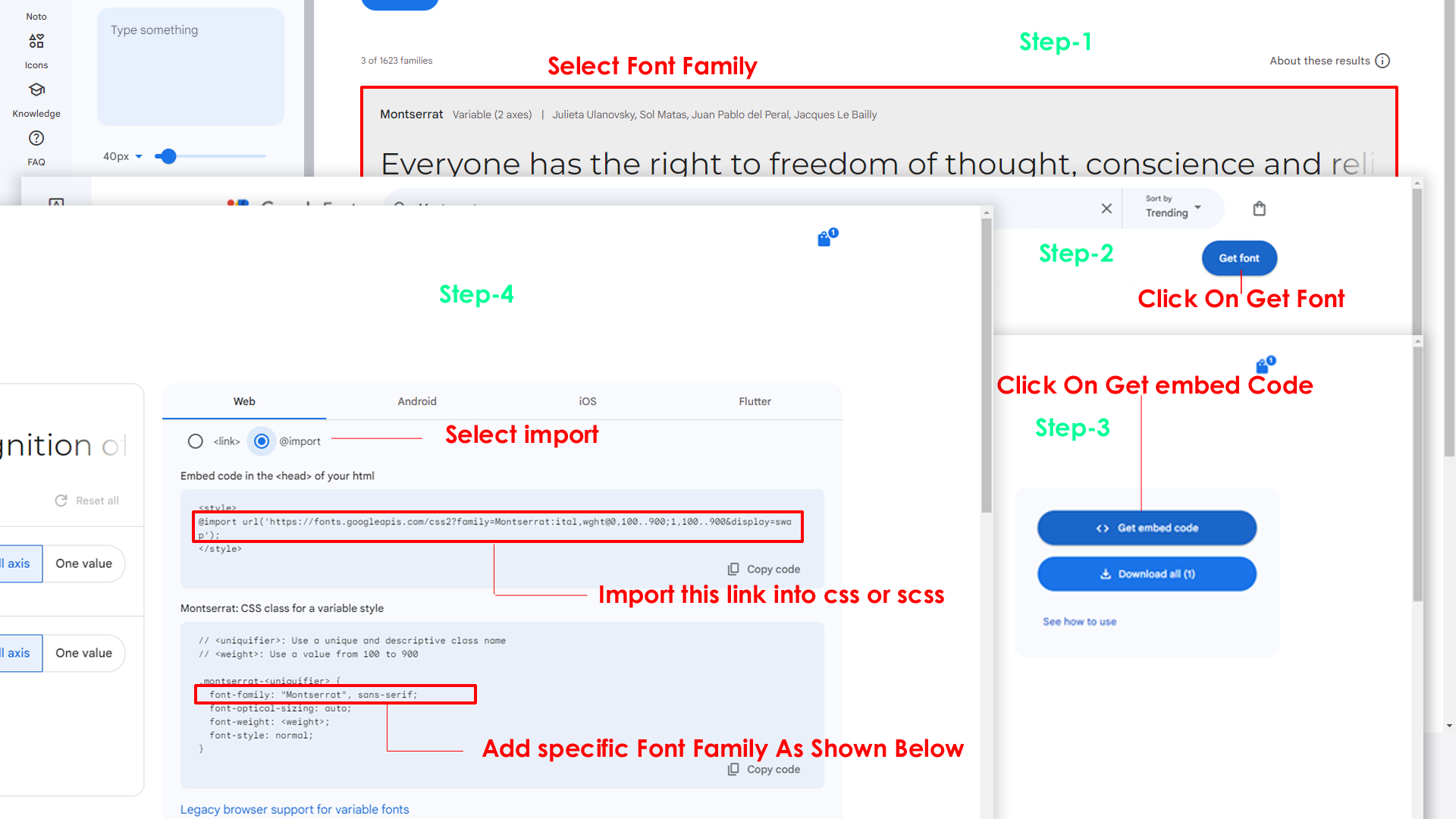
Step 2:
And paste Your Selected font-family in style.scss
Example:

Step 3:
And add the Your Selected font-family in _variables.scss(public/scss/_variables.scss)
Example:
--default-font-family: "Montserrat", sans-serif;
By default menu icons are Boxicons if you
want to change icons please follow below steps
Step 1 :
To change Menu icons, open nav.js file
Path:components/common-files/sidebar/nav.js you can find the
array of objects in that icon propery is for images, you
can change values in icons property to see changes.
Go To "/public/images/brand-logos" folder and replace your logo with Previous Logos within in image size. note: Please don't increase logo sizes. Replace your logo within given image size. otherwise the logo will not fit in particular place it disturbs the template design.
To clear LocalStorage(cookie)
Step1:
Open switcher.js file
stores/switcher.js
To clear LocalStorage loading functions you need to remove lines which are reassigning the localStorage value in retrieveFromLocalStorage function in actions.
retrieveFromLocalStorage() {
	this.colorthemeFn(this.colortheme);
	this.directionFn(this.direction);
	this.navigationStylesFn(this.navigationStyles);
	this.pageStylesFn(this.pageStyles);
	this.widthStylesFn(this.widthStyles);
	this.menuPositionFn(this.menuPosition);
	this.headerPositionFn(this.headerPosition);
	this.menuColorFn(this.menuColor);
	this.headerColorFn(this.headerColor);
	this.themePrimaryFn(this.themePrimary);
	if (this.themeBackground) {
		this.themeBackgroundFn(this.themeBackground);
	}
	this.backgroundImageFn(this.backgroundImage);
	if (!localStorage.getItem('ynexverticalstyles')) {
			this.menuStylesFn(this.menuStyles);
	}
	if (!localStorage.getItem('ynexmenuStyles') && localStorage.getItem('ynexnavstyles') != 'horizontal') {
		this.layoutStylesFn(this.layoutStyles);
	}
},
Disabling Switcher
To remove switcher icons from landingpage header remove
below code incomponents/common-files/header.vue
file
		<!-- Start::header-element -->
		<a href="javascript:void(0);" class="header-link switcher-icon" data-bs-toggle="offcanvas" data-bs-target="#switcher-canvas">
                    <svg xmlns="http://www.w3.org/2000/svg" class="header-link-icon" height="24px" viewBox="0 0 24 24" width="24px" fill="#5f6368">
                        <path d="M0 0h24v24H0V0z" fill="none" />
                        <path d="M19.43 12.98c.04-.32.07-.64.07-.98 0-.34-.03-.66-.07-.98l2.11-1.65c.19-.15.24-.42.12-.64l-2-3.46c-.09-.16-.26-.25-.44-.25-.06 0-.12.01-.17.03l-2.49 1c-.52-.4-1.08-.73-1.69-.98l-.38-2.65C14.46 2.18 14.25 2 14 2h-4c-.25 0-.46.18-.49.42l-.38 2.65c-.61.25-1.17.59-1.69.98l-2.49-1c-.06-.02-.12-.03-.18-.03-.17 0-.34.09-.43.25l-2 3.46c-.13.22-.07.49.12.64l2.11 1.65c-.04.32-.07.65-.07.98 0 .33.03.66.07.98l-2.11 1.65c-.19.15-.24.42-.12.64l2 3.46c.09.16.26.25.44.25.06 0 .12-.01.17-.03l2.49-1c.52.4 1.08.73 1.69.98l.38 2.65c.03.24.24.42.49.42h4c.25 0 .46-.18.49-.42l.38-2.65c.61-.25 1.17-.59 1.69-.98l2.49 1c.06.02.12.03.18.03.17 0 .34-.09.43-.25l2-3.46c.12-.22.07-.49-.12-.64l-2.11-1.65zm-1.98-1.71c.04.31.05.52.05.73 0 .21-.02.43-.05.73l-.14 1.13.89.7 1.08.84-.7 1.21-1.27-.51-1.04-.42-.9.68c-.43.32-.84.56-1.25.73l-1.06.43-.16 1.13-.2 1.35h-1.4l-.19-1.35-.16-1.13-1.06-.43c-.43-.18-.83-.41-1.23-.71l-.91-.7-1.06.43-1.27.51-.7-1.21 1.08-.84.89-.7-.14-1.13c-.03-.31-.05-.54-.05-.74s.02-.43.05-.73l.14-1.13-.89-.7-1.08-.84.7-1.21 1.27.51 1.04.42.9-.68c.43-.32.84-.56 1.25-.73l1.06-.43.16-1.13.2-1.35h1.39l.19 1.35.16 1.13 1.06.43c.43.18.83.41 1.23.71l.91.7 1.06-.43 1.27-.51.7 1.21-1.07.85-.89.7.14 1.13zM12 8c-2.21 0-4 1.79-4 4s1.79 4 4 4 4-1.79 4-4-1.79-4-4-4zm0 6c-1.1 0-2-.9-2-2s.9-2 2-2 2 .9 2 2-.9 2-2 2z" />
                    </svg>
                </a>
		<!-- End::header-element -->
To remove switcher from all the pages go to
layouts/* file. And remove the
<Switcher /> and <CustomSwitcher />
To remove switcher icons from landingpage header remove
below code incomponents/common/header.vue
file
		<!-- Start::header-element -->
		<button class="btn btn-wave btn-icon btn-secondary switcher-icon d-flex align-items-center justify-content-center" data-bs-toggle="offcanvas"    data-bs-target="#switcher-canvas">
                                <i class="ri-settings-3-line">
                            </button>
		<!-- End::header-element -->
To remove switcher from all the pages go
tolayouts/* file. And remove the
<Switcher /> and <CustomSwitcher />
Refer following links for usage:
| Icons | References |
|---|---|
| Bootstrap Icons | https://icons.getbootstrap.com/ |
| Boxicons | https://boxicons.com/ |
| Remix Icons | https://remixicon.com/ |
| Feather Icons | https://feathericons.com/ |
| Tabler Icons | https://tabler-icons.io/ |
| Line Awesome Icons | https://icons8.com/line-awesome |
| phosphor Icons | https://phosphoricons.com/ |
Refer following links for usage:
| Images | References |
|---|---|
| Vecteezy | https://www.vecteezy.com/ |
| Iconscount | https://iconscout.com/ |
| Unsplash | https://unsplash.com/ |
| Png Tree | https://pngtree.com/ |
| flaticon | https://www.flaticon.com/authors/flat-icons |
| freepik | https://www.freepik.com |
Refer following links for usage:
| Google Fonts | https://fonts.google.com/ |
Refer following links for usage:
| phosphor Icons | https://phosphoricons.com/ |
All plugins runs through npm.
If you want new plugins : Install new plugin from npm then run
npm run dev command.
Reusable basic tables are versatile structures used to organize and display data efficiently. They can be adapted for various applications, offering flexibility for consistent and structured information presentation.
1. You need to add these files to make basic tables work.
Reusable Chart.js charts are pre-configured chart templates that can be easily reused across different projects or sections of a website. They allow for quick and consistent data visualization with minimal configuration, enhancing efficiency and maintainability.
1. You need to add these files to make chartjs work.
Most files, such as dashboards, apps, pages, tables, and maps, are designed to be reusable, with the examples above showcasing just a few of them. These reusable components provide flexibility, allowing developers to efficiently build and maintain consistent, dynamic interfaces across various projects.
Please follow the below steps to change Primary Color
Step 1 :
To change Primary Color you have to open _variables.scss file and replace what color you want as shown in below
Rootpath : _variables.scss (public/assets/scss/_variables.scss )
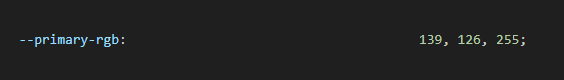
npm run sass command.Please follow the below steps to change Dark body Color
Step 1 :
Make sure the theme is set completely to dark mode by adding the following attributes to the html tag data-theme-mode="dark" data-header-styles="dark" data-menu-styles="dark"
Step 2 :
To change Dark body Color you have to open _variables.scss file and replace what color you want as shown in below
Rootpath : _variables.scss (public/assets/scss/_variables.scss )
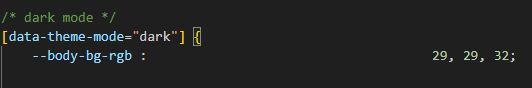
Step 3 :
Also Change the following variable colors to the desired theme background accordingly in [data-theme-mode="dark"]
--light-rgb : --form-control-bg : --body-bg-rgb2 : --input-border : --gray-3 :npm run sass command.